| Statistics | We have 1675 registered users
The newest registered user is dejo123
Our users have posted a total of 30851 messages in 1411 subjects
|
| Who is online? | In total there are 3 users online :: 0 Registered, 0 Hidden and 3 Guests None Most users ever online was 443 on Sun Mar 17, 2013 5:41 pm |
| Latest topics | » THIS FORUM IS NOW OBSOLETE
![[ARC] Menu Discussion Empty](https://2img.net/i/fa/empty.gif) by NickTheNick Sat Sep 26, 2015 10:26 pm by NickTheNick Sat Sep 26, 2015 10:26 pm
» To all the people who come here looking for thrive.
![[ARC] Menu Discussion Empty](https://2img.net/i/fa/empty.gif) by NickTheNick Sat Sep 26, 2015 10:22 pm by NickTheNick Sat Sep 26, 2015 10:22 pm
» Build Error Code::Blocks / CMake
![[ARC] Menu Discussion Empty](https://2img.net/i/fa/empty.gif) by crovea Tue Jul 28, 2015 5:28 pm by crovea Tue Jul 28, 2015 5:28 pm
» Hello! I can translate in japanese
![[ARC] Menu Discussion Empty](https://2img.net/i/fa/empty.gif) by tjwhale Thu Jul 02, 2015 7:23 pm by tjwhale Thu Jul 02, 2015 7:23 pm
» On Leave (Offline thread)
![[ARC] Menu Discussion Empty](https://2img.net/i/fa/empty.gif) by NickTheNick Wed Jul 01, 2015 12:20 am by NickTheNick Wed Jul 01, 2015 12:20 am
» Devblog #14: A Brave New Forum
![[ARC] Menu Discussion Empty](https://2img.net/i/fa/empty.gif) by NickTheNick Mon Jun 29, 2015 4:49 am by NickTheNick Mon Jun 29, 2015 4:49 am
» Application for Programmer
![[ARC] Menu Discussion Empty](https://2img.net/i/fa/empty.gif) by crovea Fri Jun 26, 2015 11:14 am by crovea Fri Jun 26, 2015 11:14 am
» Re-Reapplication
![[ARC] Menu Discussion Empty](https://2img.net/i/fa/empty.gif) by The Creator Thu Jun 25, 2015 10:57 pm by The Creator Thu Jun 25, 2015 10:57 pm
» Application (programming)
![[ARC] Menu Discussion Empty](https://2img.net/i/fa/empty.gif) by crovea Tue Jun 23, 2015 8:00 am by crovea Tue Jun 23, 2015 8:00 am
» Achieving Sapience
![[ARC] Menu Discussion Empty](https://2img.net/i/fa/empty.gif) by MitochondriaBox Sun Jun 21, 2015 7:03 pm by MitochondriaBox Sun Jun 21, 2015 7:03 pm
» Microbe Stage GDD
![[ARC] Menu Discussion Empty](https://2img.net/i/fa/empty.gif) by tjwhale Sat Jun 20, 2015 3:44 pm by tjwhale Sat Jun 20, 2015 3:44 pm
» Application for Programmer/ Theorist
![[ARC] Menu Discussion Empty](https://2img.net/i/fa/empty.gif) by tjwhale Wed Jun 17, 2015 9:56 am by tjwhale Wed Jun 17, 2015 9:56 am
» Application for a 3D Modeler.
![[ARC] Menu Discussion Empty](https://2img.net/i/fa/empty.gif) by Kaiju4u Wed Jun 10, 2015 11:16 am by Kaiju4u Wed Jun 10, 2015 11:16 am
» Presentation
![[ARC] Menu Discussion Empty](https://2img.net/i/fa/empty.gif) by Othithu Tue Jun 02, 2015 10:38 am by Othithu Tue Jun 02, 2015 10:38 am
» Application of Sorts
![[ARC] Menu Discussion Empty](https://2img.net/i/fa/empty.gif) by crovea Sun May 31, 2015 5:06 pm by crovea Sun May 31, 2015 5:06 pm
» want to contribute
![[ARC] Menu Discussion Empty](https://2img.net/i/fa/empty.gif) by Renzope Sun May 31, 2015 12:58 pm by Renzope Sun May 31, 2015 12:58 pm
» Music List Thread (Post New Themes Here)
![[ARC] Menu Discussion Empty](https://2img.net/i/fa/empty.gif) by Oliveriver Thu May 28, 2015 1:06 pm by Oliveriver Thu May 28, 2015 1:06 pm
» Application: English-Spanish translator
![[ARC] Menu Discussion Empty](https://2img.net/i/fa/empty.gif) by Renzope Tue May 26, 2015 1:53 pm by Renzope Tue May 26, 2015 1:53 pm
» Want to be promoter or project manager
![[ARC] Menu Discussion Empty](https://2img.net/i/fa/empty.gif) by TheBudderBros Sun May 24, 2015 9:00 pm by TheBudderBros Sun May 24, 2015 9:00 pm
» A new round of Forum Revamps!
![[ARC] Menu Discussion Empty](https://2img.net/i/fa/empty.gif) by Oliveriver Wed May 20, 2015 11:32 am by Oliveriver Wed May 20, 2015 11:32 am
|
|
| | [ARC] Menu Discussion |  |
|
+7Noitulove US_of_Alaska Gotrol Tenebrarum Djohaal caekdaemon The Uteen 11 posters | |
| Author | Message |
|---|
The Uteen
Sandbox Team Lead
Posts : 1476
Reputation : 70
Join date : 2010-07-06
Age : 28
Location : England, Virgo Supercluster
![[ARC] Menu Discussion Empty](https://2img.net/i/empty.gif) |  Subject: [ARC] Menu Discussion Subject: [ARC] Menu Discussion ![[ARC] Menu Discussion Empty](https://2img.net/i/fa/empty.gif) Mon Dec 13, 2010 2:59 pm Mon Dec 13, 2010 2:59 pm | |
| Can I just ask, what is the difference between menu and menue?
Anyway, will the main menu(e?) have animation? If so, how much? In fact, what will be on the menu(e???) in the first place?
Lets shorten it down to one simple question: What's the second 'e' abou- No, wait: Is the menu(e)
Make that two:
What is the menu(e) going to be like?
How on earth do you spell it?
Last edited by The Uteen on Tue Dec 14, 2010 3:40 pm; edited 1 time in total | |
|   | | caekdaemon
Newcomer
Posts : 88
Reputation : 0
Join date : 2010-10-27
![[ARC] Menu Discussion Empty](https://2img.net/i/empty.gif) |  Subject: Re: [ARC] Menu Discussion Subject: Re: [ARC] Menu Discussion ![[ARC] Menu Discussion Empty](https://2img.net/i/fa/empty.gif) Mon Dec 13, 2010 3:15 pm Mon Dec 13, 2010 3:15 pm | |
| Menu is spelt as menu. Get chrome, it corrects spelling mistakes.
I imagine there will be a galaxy in the background spinning, or a planet. Maybe a cell splitting or something, with the Menu buttons at a side. | |
|   | | Djohaal
Learner

Posts : 144
Reputation : 1
Join date : 2010-12-03
![[ARC] Menu Discussion Empty](https://2img.net/i/empty.gif) |  Subject: Re: [ARC] Menu Discussion Subject: Re: [ARC] Menu Discussion ![[ARC] Menu Discussion Empty](https://2img.net/i/fa/empty.gif) Mon Dec 13, 2010 3:29 pm Mon Dec 13, 2010 3:29 pm | |
| Umm... isn't it a bit early to start thinking about this? We don't even have a working engine. | |
|   | | Tenebrarum
Society Team Lead

Posts : 1179
Reputation : 32
Join date : 2010-10-01
Age : 31
Location : ph'nglui mglw'nafh Cthulhu R'lyeh wgah'nagl fhtagn
![[ARC] Menu Discussion Empty](https://2img.net/i/empty.gif) |  Subject: Re: [ARC] Menu Discussion Subject: Re: [ARC] Menu Discussion ![[ARC] Menu Discussion Empty](https://2img.net/i/fa/empty.gif) Mon Dec 13, 2010 4:35 pm Mon Dec 13, 2010 4:35 pm | |
| - Djohaal wrote:
- Umm... isn't it a bit early to start thinking about this? We don't even have a working engine.
QFT | |
|   | | The Uteen
Sandbox Team Lead

Posts : 1476
Reputation : 70
Join date : 2010-07-06
Age : 28
Location : England, Virgo Supercluster
![[ARC] Menu Discussion Empty](https://2img.net/i/empty.gif) |  Subject: Re: [ARC] Menu Discussion Subject: Re: [ARC] Menu Discussion ![[ARC] Menu Discussion Empty](https://2img.net/i/fa/empty.gif) Tue Dec 14, 2010 3:43 pm Tue Dec 14, 2010 3:43 pm | |
| - Djohaal wrote:
- Umm... isn't it a bit early to start thinking about this? We don't even have a working engine.
I think it would be good to have some sort of concept for the menu (and I have chrome, it says menue is correct too), so then we can build it up going by this concept as we create each feature. We ought to have at least some sort of idea on what sort of options you will have, and how it will be presented. Also, having some sort of menu does make it all seem more... Professional, and expandable. | |
|   | | Gotrol
Art Team Lead

Posts : 127
Reputation : 0
Join date : 2010-10-06
Age : 33
Location : Европа, (GMT +1)
![[ARC] Menu Discussion Empty](https://2img.net/i/empty.gif) |  Subject: Re: [ARC] Menu Discussion Subject: Re: [ARC] Menu Discussion ![[ARC] Menu Discussion Empty](https://2img.net/i/fa/empty.gif) Tue Dec 14, 2010 4:12 pm Tue Dec 14, 2010 4:12 pm | |
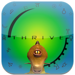
| Always Imagined the menu background being something to represent the state of your homeworld. Something like the background of this forum, a planet, but dynamic. At first only a rock, then with atmosphere, cities, superstructures, etc...
Also connects with the Iconic picture that is used to represent thrive everywhere =). | |
|   | | US_of_Alaska
Overall Team Co-Lead

Posts : 1335
Reputation : 29
Join date : 2010-07-07
Age : 31
Location : Australia
![[ARC] Menu Discussion Empty](https://2img.net/i/empty.gif) |  Subject: Re: [ARC] Menu Discussion Subject: Re: [ARC] Menu Discussion ![[ARC] Menu Discussion Empty](https://2img.net/i/fa/empty.gif) Tue Dec 14, 2010 11:16 pm Tue Dec 14, 2010 11:16 pm | |
| - Gotrol wrote:
- Always Imagined the menu background being something to represent the state of your homeworld. Something like the background of this forum, a planet, but dynamic. At first only a rock, then with atmosphere, cities, superstructures, etc...
Also connects with the Iconic picture that is used to represent thrive everywhere =). I think that's good, we can just have a few planets and scenarios that it cycles through to keep it fresh. | |
|   | | Noitulove
Regular
Posts : 237
Reputation : 0
Join date : 2010-07-09
![[ARC] Menu Discussion Empty](https://2img.net/i/empty.gif) |  Subject: Re: [ARC] Menu Discussion Subject: Re: [ARC] Menu Discussion ![[ARC] Menu Discussion Empty](https://2img.net/i/fa/empty.gif) Tue Dec 14, 2010 11:30 pm Tue Dec 14, 2010 11:30 pm | |
| We haven't even gotten the engine down yet, but when that comes out (menu functions included) I think we should go with the "spiky" menu as shown on this page of the Concept Art thread.Think: some sort of crystal/floating island thing, maybe with some 'vines' hanging from the underside and a couple of planets rotating around the menu. One might be bigger than the other. Or, maybe that smaller one could be a moon, orbiting around the larger planet. I may or may not make a mockup. | |
|   | | The Uteen
Sandbox Team Lead

Posts : 1476
Reputation : 70
Join date : 2010-07-06
Age : 28
Location : England, Virgo Supercluster
![[ARC] Menu Discussion Empty](https://2img.net/i/empty.gif) |  Subject: Re: [ARC] Menu Discussion Subject: Re: [ARC] Menu Discussion ![[ARC] Menu Discussion Empty](https://2img.net/i/fa/empty.gif) Wed Dec 15, 2010 12:11 pm Wed Dec 15, 2010 12:11 pm | |
| I thought that was an in-game Interface, but I suppose it could work as a main menu, too.
And I like the idea of dynamic planets, too. And going with the idea of multiple saves, maybe arrow buttons could be on the menu to cycle through the planets to find your save. Not just scrolling through them, though, something a bit more cool. Maybe they could be shown in the the menu in their own little solar system, orbiting a star, at a distance they would be at normally. That'd be interesting, finding your planet based on temperature. And the star could be new game. Maybe an asteroid belt could be extras. Or just an asteroid. | |
|   | | Darkgamma
Learner

Posts : 155
Reputation : 2
Join date : 2010-11-21
Location : Dort, am Klavier
![[ARC] Menu Discussion Empty](https://2img.net/i/empty.gif) |  Subject: Re: [ARC] Menu Discussion Subject: Re: [ARC] Menu Discussion ![[ARC] Menu Discussion Empty](https://2img.net/i/fa/empty.gif) Wed Dec 15, 2010 12:14 pm Wed Dec 15, 2010 12:14 pm | |
| - Tenebrarum wrote:
- Djohaal wrote:
- Umm... isn't it a bit early to start thinking about this? We don't even have a working engine.
QFT Double QFT | |
|   | | Gotrol
Art Team Lead

Posts : 127
Reputation : 0
Join date : 2010-10-06
Age : 33
Location : Европа, (GMT +1)
![[ARC] Menu Discussion Empty](https://2img.net/i/empty.gif) |  Subject: Re: [ARC] Menu Discussion Subject: Re: [ARC] Menu Discussion ![[ARC] Menu Discussion Empty](https://2img.net/i/fa/empty.gif) Wed Dec 15, 2010 1:08 pm Wed Dec 15, 2010 1:08 pm | |
| I do not agree. If we have the time and people why not multitask? Besides any menu can be implemented in any application, it doesn't depend on the engine.
Anyhow, further outlining of my idea.
http://gotrol.deviantart.com/art/Main-Menu-Concept-1-189675559 | |
|   | | ~sciocont
Overall Team Lead

Posts : 3406
Reputation : 138
Join date : 2010-07-06
![[ARC] Menu Discussion Empty](https://2img.net/i/empty.gif) |  Subject: Re: [ARC] Menu Discussion Subject: Re: [ARC] Menu Discussion ![[ARC] Menu Discussion Empty](https://2img.net/i/fa/empty.gif) Wed Dec 15, 2010 6:25 pm Wed Dec 15, 2010 6:25 pm | |
| - US_of_Alaska wrote:
- Gotrol wrote:
- Always Imagined the menu background being something to represent the state of your homeworld. Something like the background of this forum, a planet, but dynamic. At first only a rock, then with atmosphere, cities, superstructures, etc...
Also connects with the Iconic picture that is used to represent thrive everywhere =). I think that's good, we can just have a few planets and scenarios that it cycles through to keep it fresh. I like that idea, it sounds really nice-looking. | |
|   | | Darkgamma
Learner

Posts : 155
Reputation : 2
Join date : 2010-11-21
Location : Dort, am Klavier
![[ARC] Menu Discussion Empty](https://2img.net/i/empty.gif) |  Subject: Re: [ARC] Menu Discussion Subject: Re: [ARC] Menu Discussion ![[ARC] Menu Discussion Empty](https://2img.net/i/fa/empty.gif) Wed Dec 15, 2010 7:05 pm Wed Dec 15, 2010 7:05 pm | |
|
Last edited by Darkgamma on Wed Dec 15, 2010 7:07 pm; edited 1 time in total | |
|   | | Darkgamma
Learner

Posts : 155
Reputation : 2
Join date : 2010-11-21
Location : Dort, am Klavier
![[ARC] Menu Discussion Empty](https://2img.net/i/empty.gif) |  Subject: Re: [ARC] Menu Discussion Subject: Re: [ARC] Menu Discussion ![[ARC] Menu Discussion Empty](https://2img.net/i/fa/empty.gif) Wed Dec 15, 2010 7:06 pm Wed Dec 15, 2010 7:06 pm | |
| Well, I suppose we could do menu concepts and preparations. | |
|   | | ~sciocont
Overall Team Lead

Posts : 3406
Reputation : 138
Join date : 2010-07-06
![[ARC] Menu Discussion Empty](https://2img.net/i/empty.gif) |  Subject: Re: [ARC] Menu Discussion Subject: Re: [ARC] Menu Discussion ![[ARC] Menu Discussion Empty](https://2img.net/i/fa/empty.gif) Wed Dec 15, 2010 10:38 pm Wed Dec 15, 2010 10:38 pm | |
| - Darkgamma wrote:
- Well, I suppose we could do menu concepts and preparations.
Really, its just a menu. I mean, it'll obviously have to look nice, but with me and Gotrol on it, that won't be a problem. basically it needs -options -saved games -new game -Content --Editors --TCL -Thrive website link | |
|   | | The Uteen
Sandbox Team Lead

Posts : 1476
Reputation : 70
Join date : 2010-07-06
Age : 28
Location : England, Virgo Supercluster
![[ARC] Menu Discussion Empty](https://2img.net/i/empty.gif) |  Subject: Re: [ARC] Menu Discussion Subject: Re: [ARC] Menu Discussion ![[ARC] Menu Discussion Empty](https://2img.net/i/fa/empty.gif) Thu Dec 16, 2010 1:26 pm Thu Dec 16, 2010 1:26 pm | |
| - ~sciocont wrote:
- Darkgamma wrote:
- Well, I suppose we could do menu concepts and preparations.
Really, its just a menu. I mean, it'll obviously have to look nice, but with me and Gotrol on it, that won't be a problem.
basically it needs
-options
-saved games
-new game
-Content
--Editors
--TCL
-Thrive website link A website link? In-game? I'd hate it if I was in the game and clicked it to see what it did and it quit the whole game and launched my browser (without permission) to show me the Thrive website that I probably already know about because I downloaded the game there. That'd be bad. And add 'Extras' to it too, for things like concept art and maybe prototype clips, and 'The Making Of Thrive'. It'd be nice to show the players how the game was created, especially with the epic tale of how it was a hoax in the beginning, then there's the whole Sven story and then the incredible arrival of Bashinerox after that... Not to mention the things that are going to happen, if this interesting stuff keeps happening. In response to people saying "We're too early on in development to worry about this. ". Well... Think about this: We are making the game cell first, ascension last. Adding in ascension is probably years off, but we are making concepts for god tools and ascension gates. So why can't we make concepts for the menu as well, even if that too is years off? | |
|   | | Gotrol
Art Team Lead

Posts : 127
Reputation : 0
Join date : 2010-10-06
Age : 33
Location : Европа, (GMT +1)
![[ARC] Menu Discussion Empty](https://2img.net/i/empty.gif) |  Subject: Re: [ARC] Menu Discussion Subject: Re: [ARC] Menu Discussion ![[ARC] Menu Discussion Empty](https://2img.net/i/fa/empty.gif) Thu Dec 16, 2010 1:55 pm Thu Dec 16, 2010 1:55 pm | |
| Personally I'm more into serious looking menues than artistic looking one's. This is planned to be a serious game, so why add the fluff? I think they should have a sci-fi feel to them, but that can be created only with color and shape manipulation, no special FX on the tabs.
Editor menues are still a subject to discuss, IMHO, and its best to keep them the same style as the main menu.
EDIT;
First concept Updated with specie name
http://gotrol.deviantart.com/gallery/26943847#/d34xelj
An example
http://gotrol.deviantart.com/gallery/26943847#/d34zvy8
Another context based concept. You would have to click on the body to brink up contextual menues
http://gotrol.deviantart.com/gallery/26943847#/d34zw1j
Or (personal favourite) Relative size based menu. If you have a sattelite you'd have it look like this
http://gotrol.deviantart.com/gallery/26943847#/d34zx8x
If its an asteroid, it would be displayed as a part of the belt, or asteroid group/cloud. If its a planet it will be dispayed like concept 1.
| |
|   | | Tenebrarum
Society Team Lead

Posts : 1179
Reputation : 32
Join date : 2010-10-01
Age : 31
Location : ph'nglui mglw'nafh Cthulhu R'lyeh wgah'nagl fhtagn
![[ARC] Menu Discussion Empty](https://2img.net/i/empty.gif) |  Subject: Re: [ARC] Menu Discussion Subject: Re: [ARC] Menu Discussion ![[ARC] Menu Discussion Empty](https://2img.net/i/fa/empty.gif) Thu Dec 16, 2010 5:21 pm Thu Dec 16, 2010 5:21 pm | |
| As obvious as using the planet seems, I object to it. If we use the planet, than I think it would really take the fun out of choosing to randomize your world and figure it out through exploration and gameplay. In this scenario I'd know right off the bat what the landmasses would look like, how large any satellites are and how close to my world. All the stuff we could never actually know before space travel.
I suggest that we have the menu act like it does in Half Life 2 and it's subsequent episodes. Have the menu be very simple and stark, much like your design, but have the camera cycle through a few quiet pans of environments you've been in recently.
This might be annoying and difficult to program, so we may have to toss it, but I'd say just a quiet pan of any number of environments would be lovely. A veiw of a small, snowbound village (Society Stage). A cave with bioluminescent worms hugging the walls. A ship sailing the ocean, or a starship gliding through deep space. A savanna with a baobab in the forground, and an occasional bird-like org gliding overhead. A forest viewed from a mountain top. A star. A nebula.
I dislike the way Spore stressed it's Creature and Space stages so heavily. I, amung others here, am hoping for a game balanced in it's focus.
Also, this idea is another reason to wait on making the main menu until we have an actual engine. | |
|   | | Gotrol
Art Team Lead

Posts : 127
Reputation : 0
Join date : 2010-10-06
Age : 33
Location : Европа, (GMT +1)
![[ARC] Menu Discussion Empty](https://2img.net/i/empty.gif) |  Subject: Re: [ARC] Menu Discussion Subject: Re: [ARC] Menu Discussion ![[ARC] Menu Discussion Empty](https://2img.net/i/fa/empty.gif) Thu Dec 16, 2010 5:41 pm Thu Dec 16, 2010 5:41 pm | |
| When you press "New Game" you won't see anything, but a selection of options for your planet. If you want, you can always press "Random". There are ways to work around the "reveal" problem, all I wanted was to have something dynamic, which reflects you current progress in game on a larger scale.
Again, menu style and organization has very little to do with the actual engine, perhaps the way dynamic objects look visually, but thats it. Example, does your internet browser shortcut's size and location depend or affect the running of the program? Thats what menue's are, shortcuts.
EDIT; this is just a concept, it can always be scratched. I'm not clinging to it, I just think its optimal, and unique. | |
|   | | Commander Keen
Industrial Team Lead

Posts : 1123
Reputation : 36
Join date : 2010-07-23
Location : Czech Republic (not that anyone would know where it is...)
![[ARC] Menu Discussion Empty](https://2img.net/i/empty.gif) |  Subject: Re: [ARC] Menu Discussion Subject: Re: [ARC] Menu Discussion ![[ARC] Menu Discussion Empty](https://2img.net/i/fa/empty.gif) Thu Dec 16, 2010 6:17 pm Thu Dec 16, 2010 6:17 pm | |
| New game planet selection should really be random until we have God tools. | |
|   | | Tenebrarum
Society Team Lead

Posts : 1179
Reputation : 32
Join date : 2010-10-01
Age : 31
Location : ph'nglui mglw'nafh Cthulhu R'lyeh wgah'nagl fhtagn
![[ARC] Menu Discussion Empty](https://2img.net/i/empty.gif) |  Subject: Re: [ARC] Menu Discussion Subject: Re: [ARC] Menu Discussion ![[ARC] Menu Discussion Empty](https://2img.net/i/fa/empty.gif) Thu Dec 16, 2010 6:24 pm Thu Dec 16, 2010 6:24 pm | |
| - Commander Keen wrote:
- New game planet selection should really be random until we have God tools.
To be honest, I think the first play through should be required auto-evo only(No direct edits), with random planet. @Gotrol: I don't see how your idea shows where the player is in the game. | |
|   | | Commander Keen
Industrial Team Lead

Posts : 1123
Reputation : 36
Join date : 2010-07-23
Location : Czech Republic (not that anyone would know where it is...)
![[ARC] Menu Discussion Empty](https://2img.net/i/empty.gif) |  Subject: Re: [ARC] Menu Discussion Subject: Re: [ARC] Menu Discussion ![[ARC] Menu Discussion Empty](https://2img.net/i/fa/empty.gif) Thu Dec 16, 2010 6:26 pm Thu Dec 16, 2010 6:26 pm | |
| - Tenebrarum wrote:
- To be honest, I think the first play through should be required auto-evo only(No direct edits), with random planet.
It already works that way without God Tools, doesn't it? | |
|   | | Gotrol
Art Team Lead

Posts : 127
Reputation : 0
Join date : 2010-10-06
Age : 33
Location : Европа, (GMT +1)
![[ARC] Menu Discussion Empty](https://2img.net/i/empty.gif) |  Subject: Re: [ARC] Menu Discussion Subject: Re: [ARC] Menu Discussion ![[ARC] Menu Discussion Empty](https://2img.net/i/fa/empty.gif) Thu Dec 16, 2010 7:15 pm Thu Dec 16, 2010 7:15 pm | |
| Allright, from the first time opening the game till spacefaring.
First time you open the game you should see smth like this
http://gotrol.deviantart.com/gallery/#/d350ckk
Then when you have a creature, but it is non-sapient
http://gotrol.deviantart.com/gallery/#/d350cx5
Then sapient, but lacks the tech for exploring
http://gotrol.deviantart.com/gallery/#/d350d8g
later full view
http://gotrol.deviantart.com/gallery/#/d34xelj
This is a definition of a dynamic main menu for me. I hope this is not too hard to script, and definetly needs some discussion. We can always take the wasy route and have a static main menu XD.
| |
|   | | Tenebrarum
Society Team Lead

Posts : 1179
Reputation : 32
Join date : 2010-10-01
Age : 31
Location : ph'nglui mglw'nafh Cthulhu R'lyeh wgah'nagl fhtagn
![[ARC] Menu Discussion Empty](https://2img.net/i/empty.gif) |  Subject: Re: [ARC] Menu Discussion Subject: Re: [ARC] Menu Discussion ![[ARC] Menu Discussion Empty](https://2img.net/i/fa/empty.gif) Thu Dec 16, 2010 7:46 pm Thu Dec 16, 2010 7:46 pm | |
| Ehhhhhh... I'm still not a fan. Especially having the first thing our players see in the game be a giant question mark. | |
|   | | ~sciocont
Overall Team Lead

Posts : 3406
Reputation : 138
Join date : 2010-07-06
![[ARC] Menu Discussion Empty](https://2img.net/i/empty.gif) |  Subject: Re: [ARC] Menu Discussion Subject: Re: [ARC] Menu Discussion ![[ARC] Menu Discussion Empty](https://2img.net/i/fa/empty.gif) Thu Dec 16, 2010 11:20 pm Thu Dec 16, 2010 11:20 pm | |
| Tenebarum- that's just a representation. It could just be a darkened planet with a little outer glow, like our background, but with less light cast on it.
I'm going to do a draw-up based on the wonderful stuff Gotrol's been putting up. It will keep the regular "planet center/headings center" asthetic, but instead of a sattelite for options, it's goinfg to show actual sattelites of your planet as they are, and have two asteroids for options and such. | |
|   | | Sponsored content
![[ARC] Menu Discussion Empty](https://2img.net/i/empty.gif) |  Subject: Re: [ARC] Menu Discussion Subject: Re: [ARC] Menu Discussion ![[ARC] Menu Discussion Empty](https://2img.net/i/fa/empty.gif) | |
| |
|   | | | | [ARC] Menu Discussion |  |
|
Similar topics |  |
|
| | Permissions in this forum: | You cannot reply to topics in this forum
| |
| |
| |

![[ARC] Menu Discussion Empty](https://2img.net/i/fa/empty.gif) by
by 

![[ARC] Menu Discussion Empty](https://2img.net/i/empty.gif)

