| | Concept Art Thread |  |
|
+114Ymedron timetraveler Tritium CardoTheTripodKing PortalFan1000 MirrorMonkey2 crovea EVanimations Evol4fire Synpho Death Immortal_Dragon Totemaster ThePoisonchocolate Moterhead97 Pakpuk PerfectOrganismil NikolaAnicic007 Botifier Atrox Cellular Dinosaur Inca MrIdeaMan TheFellowWithTheHat AwesomeSiebren DeanDactyl Jimexmore penumbra espinosa Shafty Banja M3rox Cocogolem tjblazer85 pentomid Secondkingstons Tré Wisemen DesertBeagle nziswat Jiko Aiosian_Doctor_Xenox Narnobie123 WJacobC ExtraSolar Daniferrito untrustedlife RodGame Nimbal Monstahart WilliamstheJohn HAL-9000 CoolGuyChris NickTheNick Oliveriver Juodvarnis Thriving Cheese Hegataro PandaVirus Dilophoraptor decelis93 Rorsten594 Calfeggs Gawbad Orygandian2 jaws2blood PTFace Brennus Doggit uverion MeowMan1 Zetal tklarenb ido66667 lbrewer BastianKraft P3DR0PS Angelic Liom Dudeman Thrivial Pursuit Mysterious_Calligrapher ThriveVisitor Djohaal andry796 kaosrain ParadoxJuice Darkgamma ThatGuy fredpie Poisson caekdaemon AssassinBlue 2creator MassimoV Tenebrarum Slathazer Brown Spotted Kiwi Gotrol Albalrogue eumesmo Invader Darkov roadkillguy Commander Keen Partydood Pezzalis Waap Noitulove The Uteen S. Scott DragonEye4 Falthron ~sciocont GamerXA US_of_Alaska ADMIN 118 posters |
|
| Author | Message |
|---|
Commander Keen
Industrial Team Lead

Posts : 1123
Reputation : 36
Join date : 2010-07-23
Location : Czech Republic (not that anyone would know where it is...)
 |  Subject: Re: Concept Art Thread Subject: Re: Concept Art Thread  Mon Nov 22, 2010 11:06 am Mon Nov 22, 2010 11:06 am | |
| - Gotrol wrote:
- Nevertheless, we are having domesticated creatures right?
Yes, it's even on the research list (Animal Husbandry) | |
|
  | |
Pezzalis
Regular
Posts : 260
Reputation : 6
Join date : 2010-08-07
 |  Subject: Re: Concept Art Thread Subject: Re: Concept Art Thread  Thu Nov 25, 2010 9:28 pm Thu Nov 25, 2010 9:28 pm | |
| @Abalrougue: Kinda got bored one day on Spore so I made your concept creatures:   Colors are a lil crazy ahaha Probably couldn't be used or any concept art, as scio said we probably shouldn't use Spore as a base for concept art. | |
|
  | |
Albalrogue
Learner

Posts : 143
Reputation : 0
Join date : 2010-09-26
Age : 32
Location : France
 | |
  | |
~sciocont
Overall Team Lead

Posts : 3406
Reputation : 138
Join date : 2010-07-06
 |  Subject: Re: Concept Art Thread Subject: Re: Concept Art Thread  Fri Nov 26, 2010 9:47 pm Fri Nov 26, 2010 9:47 pm | |
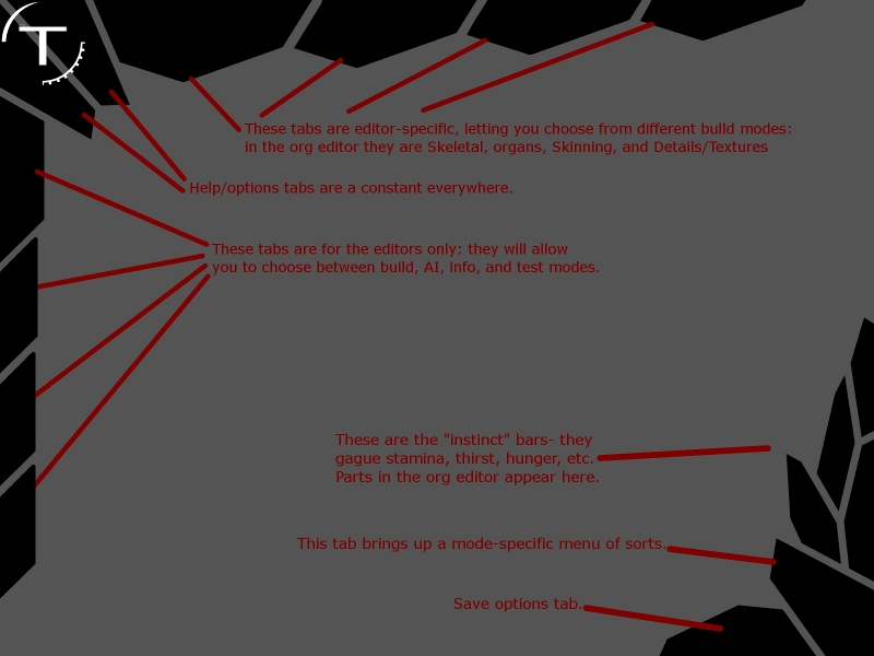
| I've got a GUI coming later as soon as i can get to my home computer. Looks beautiful, done in my shatter style. | |
|
  | |
~sciocont
Overall Team Lead

Posts : 3406
Reputation : 138
Join date : 2010-07-06
 |  Subject: Re: Concept Art Thread Subject: Re: Concept Art Thread  Fri Nov 26, 2010 10:53 pm Fri Nov 26, 2010 10:53 pm | |
| Going a little crazy with depth of field there, Pezz- too blurry.
Last edited by ~sciocont on Sat Nov 27, 2010 11:16 am; edited 1 time in total | |
|
  | |
US_of_Alaska
Overall Team Co-Lead

Posts : 1335
Reputation : 29
Join date : 2010-07-07
Age : 31
Location : Australia
 |  Subject: Re: Concept Art Thread Subject: Re: Concept Art Thread  Fri Nov 26, 2010 11:38 pm Fri Nov 26, 2010 11:38 pm | |
| - ~sciocont wrote:
- Going a little crazy with depth of field there- too blurry.
...who are you talking to? | |
|
  | |
~sciocont
Overall Team Lead

Posts : 3406
Reputation : 138
Join date : 2010-07-06
 |  Subject: Re: Concept Art Thread Subject: Re: Concept Art Thread  Sat Nov 27, 2010 1:36 pm Sat Nov 27, 2010 1:36 pm | |
|  Qiick mock-up. Everything needed is there. Tell me how you like it. | |
|
  | |
ThatGuy
Newcomer
Posts : 28
Reputation : 0
Join date : 2010-11-07
 |  Subject: Re: Concept Art Thread Subject: Re: Concept Art Thread  Sat Nov 27, 2010 2:42 pm Sat Nov 27, 2010 2:42 pm | |
| Sciocont that looks really cool. I hope we can have most of the GUI look like that because it's got a "thrive" feel to it. | |
|
  | |
Commander Keen
Industrial Team Lead

Posts : 1123
Reputation : 36
Join date : 2010-07-23
Location : Czech Republic (not that anyone would know where it is...)
 |  Subject: Re: Concept Art Thread Subject: Re: Concept Art Thread  Sat Nov 27, 2010 3:45 pm Sat Nov 27, 2010 3:45 pm | |
| Seems like a good HUD. However, these shard bars in bottom right corner might be a bit confusing and difficult to read, and I'm missing the health overview window. | |
|
  | |
Darkgamma
Learner

Posts : 155
Reputation : 2
Join date : 2010-11-21
Location : Dort, am Klavier
 |  Subject: Re: Concept Art Thread Subject: Re: Concept Art Thread  Sat Nov 27, 2010 4:22 pm Sat Nov 27, 2010 4:22 pm | |
| - ThatGuy wrote:
- Sciocont that looks really cool. I hope we can have most of the GUI look like that because it's got a "thrive" feel to it.
lol it has the "Sciocont's sig" feel to it xD It is good, rather fitting, too | |
|
  | |
Noitulove
Regular
Posts : 237
Reputation : 0
Join date : 2010-07-09
 |  Subject: Re: Concept Art Thread Subject: Re: Concept Art Thread  Sat Nov 27, 2010 5:32 pm Sat Nov 27, 2010 5:32 pm | |
| - Darkgamma wrote:
- ThatGuy wrote:
- Sciocont that looks really cool. I hope we can have most of the GUI look like that because it's got a "thrive" feel to it.
lol it has the "Sciocont's sig" feel to it xD
It is good, rather fitting, too QFT. I like it because it looks unique opposed to basically every other GUI I've seen in a video game. Like Commander Keen said, though, it could be a bit confusing, but it also looks like something I could easily get used to. Not sure about other people, though. Also, are they going to be just black or slightly colored in a way? Will they have an outer rim? Is one of those "crystals" going to glow slightly when the mouse cursor is over it? Still, it's a concept, albeit a simple one but a step in the right direction. But.. wait.. come to think of it, is that health system we proposed now scrapped, so we're bringing back ye olde health bars? In case you don't know what I mean, it was where we had a diagram of your creature with its innards visible, and when it got hurt it was tinted red in the overall area of damage? | |
|
  | |
Commander Keen
Industrial Team Lead

Posts : 1123
Reputation : 36
Join date : 2010-07-23
Location : Czech Republic (not that anyone would know where it is...)
 |  Subject: Re: Concept Art Thread Subject: Re: Concept Art Thread  Sat Nov 27, 2010 7:06 pm Sat Nov 27, 2010 7:06 pm | |
| - Noitulove wrote:
- But.. wait.. come to think of it, is that health system we proposed now scrapped, so we're bringing back ye olde health bars? In case you don't know what I mean, it was where we had a diagram of your creature with its innards visible, and when it got hurt it was tinted red in the overall area of damage?
I miss that health overview too in the concept. I'm entirely sure the concept wasn't scrapped, but it wasn't discussed it after we migrated from Evolutions. | |
|
  | |
Tenebrarum
Society Team Lead

Posts : 1179
Reputation : 32
Join date : 2010-10-01
Age : 31
Location : ph'nglui mglw'nafh Cthulhu R'lyeh wgah'nagl fhtagn
 |  Subject: Re: Concept Art Thread Subject: Re: Concept Art Thread  Sat Nov 27, 2010 8:30 pm Sat Nov 27, 2010 8:30 pm | |
| - Commander Keen wrote:
- Noitulove wrote:
- But.. wait.. come to think of it, is that health system we proposed now scrapped, so we're bringing back ye olde health bars? In case you don't know what I mean, it was where we had a diagram of your creature with its innards visible, and when it got hurt it was tinted red in the overall area of damage?
I miss that health overview too in the concept. I'm entirely sure the concept wasn't scrapped, but it wasn't discussed it after we migrated from Evolutions. I concur. I also demand we don't revert to the ever-so-popular system of just covering the screen in blood until you sit down behind a bit of wall for a few seconds until your legs grow back. | |
|
  | |
ParadoxJuice
Newcomer

Posts : 15
Reputation : 0
Join date : 2010-11-25
 |  Subject: Re: Concept Art Thread Subject: Re: Concept Art Thread  Sat Nov 27, 2010 9:07 pm Sat Nov 27, 2010 9:07 pm | |
| - ~sciocont wrote:

Qiick mock-up. Everything needed is there. Tell me how you like it. I, for one, love this. However, I'm not so sure how those 'instinct bars' will work, they seem awkwardly shaped to be any kind of bar to me. But I guess they don't HAVE to be shaped like a bar to function like one. Also, I think it should be MUCH larger for the actual org editor. Hey, this gives a cool aesthetic idea. What if those crystals change appearance based on what parts your organism is using? They won't do that on the fly, but once your done creating and start playing, they'll switch when the game loads. A scaly organism could have scales! An organism with an exoskeleton could have bones! A plant could have wood, or leaves! Though, this sounds more like a piece of flair to be added MUCH later than now.
Last edited by ParadoxJuice on Sat Nov 27, 2010 9:52 pm; edited 1 time in total (Reason for editing : TYPO GRAAAAAAAAAAAAAAAAAAAAAAAGH) | |
|
  | |
Tenebrarum
Society Team Lead

Posts : 1179
Reputation : 32
Join date : 2010-10-01
Age : 31
Location : ph'nglui mglw'nafh Cthulhu R'lyeh wgah'nagl fhtagn
 |  Subject: Re: Concept Art Thread Subject: Re: Concept Art Thread  Sat Nov 27, 2010 9:25 pm Sat Nov 27, 2010 9:25 pm | |
| - ParadoxJuice wrote:
- Hey, this gives a cool aesthetic idea. What if those crystals change appearance based on what parts your organism is using? They won't do that on the fly, but one your done creating and start playing, they'll switch when the game loads. A scaly organism could have scales! An organism with an exoskeleton could have bones! A plant could have wood, or leaves!
Though, this sounds more like a piece of flair to be added MUCH later than now. That sir, is made of pure win. | |
|
  | |
kaosrain
Newcomer

Posts : 58
Reputation : 3
Join date : 2010-11-21
Age : 25
Location : Dead frontier and civilization revolution
 |  Subject: re:concept thread Subject: re:concept thread  Sat Nov 27, 2010 10:56 pm Sat Nov 27, 2010 10:56 pm | |
| The sign of thrive should be on the save button
The parts shoul be inside the cristal and look like thy were frozen
Last edited by kaosrain on Mon Nov 29, 2010 7:21 pm; edited 1 time in total | |
|
  | |
Pezzalis
Regular

Posts : 260
Reputation : 6
Join date : 2010-08-07
 |  Subject: Re: Concept Art Thread Subject: Re: Concept Art Thread  Sun Nov 28, 2010 12:10 am Sun Nov 28, 2010 12:10 am | |
| - ~sciocont wrote:
- Going a little crazy with depth of field there, Pezz- too blurry.
Which one was that...? The concept GUI looks epic Good job | |
|
  | |
The Uteen
Sandbox Team Lead
Posts : 1476
Reputation : 70
Join date : 2010-07-06
Age : 28
Location : England, Virgo Supercluster
 |  Subject: Re: Concept Art Thread Subject: Re: Concept Art Thread  Sun Nov 28, 2010 9:54 am Sun Nov 28, 2010 9:54 am | |
| - kaosrain wrote:
- The sign of thrive should be on the save button
We are going to include an auto-save option? Everyone likes autosaves... And I could imagine these shards being slightly 3d looking and slightly see-through like aero in Windows 7. Will some of these buttons disappear when you are/aren't in an editor? | |
|
  | |
Darkgamma
Learner

Posts : 155
Reputation : 2
Join date : 2010-11-21
Location : Dort, am Klavier
 |  Subject: Re: Concept Art Thread Subject: Re: Concept Art Thread  Sun Nov 28, 2010 2:35 pm Sun Nov 28, 2010 2:35 pm | |
| - Noitulove wrote:
I like it because it looks unique opposed to basically every other GUI I've seen in a video game. Like Commander Keen said, though, it could be a bit confusing, but it also looks like something I could easily get used to. Not sure about other people, though.
Also, are they going to be just black or slightly colored in a way? Will they have an outer rim? Is one of those "crystals" going to glow slightly when the mouse cursor is over it?
Are we going Tiberium? EDIT: Yes, it seems we are | |
|
  | |
~sciocont
Overall Team Lead

Posts : 3406
Reputation : 138
Join date : 2010-07-06
 |  Subject: Re: Concept Art Thread Subject: Re: Concept Art Thread  Sun Nov 28, 2010 5:15 pm Sun Nov 28, 2010 5:15 pm | |
| Okay, this is a lot of good feedback, mostly positive. I'll try and address everything.
Instinct bars: I like this term. I forget who came up with it, it was one of our newer guys, I think. Basically they tell your health/hunger/thirst. Nothing novel there. I want the GUI to retain an organic look, so they come up as "shards" they will each have a color, and the intensity of that color will correspond to how badly you need to heal/drink/eat. In a fully fulfilled state, they will be an outline around an almost completely transparent dim glow in the middle. I think it's a lot easier than the health system with the model, although it is less specific. I think players don't really need to constantly know how they are hurt, because they should already know how they hurt themselves. And as animals, they probably won't be able to do much about it but rest.
I don't want the GUI to be flat black, how it is now. I think it should have some very subtle effects and textures, but nothing recognizable. I don't want it to look gimmicky or dated. that applies to the idea of it changing with the creature as well. I'm fine with it changing, but I don't want it to look gimmicky.
I don't see any problem with the Thrive sign being the save button. | |
|
  | |
Albalrogue
Learner

Posts : 143
Reputation : 0
Join date : 2010-09-26
Age : 32
Location : France
 |  Subject: Re: Concept Art Thread Subject: Re: Concept Art Thread  Sun Nov 28, 2010 5:21 pm Sun Nov 28, 2010 5:21 pm | |
| - ~sciocont wrote:
- Okay, this is a lot of good feedback, mostly positive. I'll try and address everything.
Instinct bars: I like this term. I forget who came up with it, it was one of our newer guys, I think. Basically they tell your health/hunger/thirst. Nothing novel there. I want the GUI to retain an organic look, so they come up as "shards" they will each have a color, and the intensity of that color will correspond to how badly you need to heal/drink/eat. In a fully fulfilled state, they will be an outline around an almost completely transparent dim glow in the middle. I think it's a lot easier than the health system with the model, although it is less specific. I think players don't really need to constantly know how they are hurt, because they should already know how they hurt themselves. And as animals, they probably won't be able to do much about it but rest.
I don't want the GUI to be flat black, how it is now. I think it should have some very subtle effects and textures, but nothing recognizable. I don't want it to look gimmicky or dated. that applies to the idea of it changing with the creature as well. I'm fine with it changing, but I don't want it to look gimmicky.
I don't see any problem with the Thrive sign being the save button. This sounds great, not to mention original. I suppose the instinct bars will be red, blue and yellow (health, thirst and hunger). However, for the thrive logo being th save button, I think it isn't a good idea. How would the player know that it's the save button? | |
|
  | |
Tenebrarum
Society Team Lead

Posts : 1179
Reputation : 32
Join date : 2010-10-01
Age : 31
Location : ph'nglui mglw'nafh Cthulhu R'lyeh wgah'nagl fhtagn
 |  Subject: Re: Concept Art Thread Subject: Re: Concept Art Thread  Sun Nov 28, 2010 5:43 pm Sun Nov 28, 2010 5:43 pm | |
| I love the idea of the shards getting duller and duller as they go down, maybe we could create overlays if they get too terribly low. Like a red throbing around the edges of the screen as you are hurt.
We haven't discussed locational damage yet. We should. | |
|
  | |
~sciocont
Overall Team Lead

Posts : 3406
Reputation : 138
Join date : 2010-07-06
 |  Subject: Re: Concept Art Thread Subject: Re: Concept Art Thread  Sun Nov 28, 2010 5:47 pm Sun Nov 28, 2010 5:47 pm | |
| - Tenebrarum wrote:
- I love the idea of the shards getting duller and duller as they go down, maybe we could create overlays if they get too terribly low. Like a red throbing around the edges of the screen as you are hurt.
We haven't discussed locational damage yet. We should. Thread, then. | |
|
  | |
Commander Keen
Industrial Team Lead

Posts : 1123
Reputation : 36
Join date : 2010-07-23
Location : Czech Republic (not that anyone would know where it is...)
 |  Subject: Re: Concept Art Thread Subject: Re: Concept Art Thread  Sun Nov 28, 2010 5:50 pm Sun Nov 28, 2010 5:50 pm | |
| - ~sciocont wrote:
- I think it's a lot easier than the health system with the model, although it is less specific. I think players don't really need to constantly know how they are hurt, because they should already know how they hurt themselves. And as animals, they probably won't be able to do much about it but rest.
There is a reason why games with complex damage management (like we have) don't use healthbars. It's simply impossible to have it predictable and effective at the same time. If a creature gets hurt two times with the same damage, only to have the bar not move at the first and jump halfway down the second, only because a more important location was hit, there's something wrong. We would have to include hitpoints to improve gameplay then. By the way, damage system was discussed long, long time ago. Time to revive it. | |
|
  | |
Gotrol
Art Team Lead
Posts : 127
Reputation : 0
Join date : 2010-10-06
Age : 33
Location : Европа, (GMT +1)
 |  Subject: Re: Concept Art Thread Subject: Re: Concept Art Thread  Sun Nov 28, 2010 5:53 pm Sun Nov 28, 2010 5:53 pm | |
| Are the tabs going to be solid colour or transparent? Just a quastion of design... maybe I missed a post or two =P | |
|
  | |
Sponsored content
 |  Subject: Re: Concept Art Thread Subject: Re: Concept Art Thread  | |
| |
|
  | |
| | Concept Art Thread |  |
|

 by
by 


