| | Art Team: We Need You! |  |
|
+22ThreeCubed Ymedron Immortal_Dragon AwesomeSiebren Raptorstorm Aiosian_Doctor_Xenox tjblazer85 Tré Wisemen Tritium hypoxanthine Narnobie123 Doggit untrustedlife Daniferrito WilliamstheJohn Theusfilipe Nimbal ~sciocont WJacobC Thriving Cheese RodGame NickTheNick 26 posters |
|
| Author | Message |
|---|
Aiosian_Doctor_Xenox
Learner

Posts : 196
Reputation : 5
Join date : 2013-05-27
Age : 34
Location : Kent
 |  Subject: Re: Art Team: We Need You! Subject: Re: Art Team: We Need You!  Sat Jun 22, 2013 12:19 pm Sat Jun 22, 2013 12:19 pm | |
| A'ight.
If you're doing it, it is going to be EPIC! | |
|
  | |
Thriving Cheese
Art Team Lead

Posts : 321
Reputation : 9
Join date : 2013-01-06
Age : 25
Location : Sweden
 |  Subject: Re: Art Team: We Need You! Subject: Re: Art Team: We Need You!  Sat Jun 22, 2013 1:32 pm Sat Jun 22, 2013 1:32 pm | |
| I just finished the bacteria on the film-layer:  | |
|
  | |
Thriving Cheese
Art Team Lead

Posts : 321
Reputation : 9
Join date : 2013-01-06
Age : 25
Location : Sweden
 |  Subject: Re: Art Team: We Need You! Subject: Re: Art Team: We Need You!  Sat Jun 22, 2013 1:33 pm Sat Jun 22, 2013 1:33 pm | |
| - Aiosian_Doctor_Xenox to ~Scio wrote:
- A'ight.
If you're doing it, it is going to be EPIC! | |
|
  | |
Aiosian_Doctor_Xenox
Learner

Posts : 196
Reputation : 5
Join date : 2013-05-27
Age : 34
Location : Kent
 |  Subject: Re: Art Team: We Need You! Subject: Re: Art Team: We Need You!  Sat Jun 22, 2013 1:43 pm Sat Jun 22, 2013 1:43 pm | |
| Welp, here's my take on the Cell Stage Gameplay GUI; Warning!: I made it at my screen resolution of 1280 x 1024. - Cell Stage GUI Concept:
Nothing but the bare-bones of the GUI, no fancy backgrounds this time. Button explanation; ? = Help Button. Thrive Logo = Menu Button. RP - 100 = This player has 100 Reproductase. MP - 100 = This player has 100 Mutation points. ATP Gauge at 50% should be self-explanatory. .3. ^-ish button = Expands a panel with either a bunch of fractional statistics of how much of the different compounds you have, basically; Compounds Held/Compound Capacity for that particular compound, or my personal idea; a Pie Chart, where the whole is the maximum holding capacity(Of all your vacuoles, other storage, etc.), and it is split into fractions of how much of a compound you have, and how much empty space is left. I didn't add the opened form of the compound-manager thing, because I wasn't sure what you guys would want for that, so I left the button 'closed'.
Last edited by Aiosian_Doctor_Xenox on Sat Jun 22, 2013 1:59 pm; edited 1 time in total | |
|
  | |
Thriving Cheese
Art Team Lead

Posts : 321
Reputation : 9
Join date : 2013-01-06
Age : 25
Location : Sweden
 |  Subject: Re: Art Team: We Need You! Subject: Re: Art Team: We Need You!  Sat Jun 22, 2013 1:58 pm Sat Jun 22, 2013 1:58 pm | |
| - Aiosian_Doctor_Xenox wrote:
- Welp, here's my take on the Cell Stage Gameplay GUI;
Warning!: I made it at my screen resolution of 1280 x 1024.
- Cell Stage GUI Concept:
Nothing but the bare-bones of the GUI, no fancy backgrounds this time. Nice mate. EDIT: I feel that we need some more things to the list on the first page of this thread. The 3d models and 2d sprite are all done and Doctor's working on the GUI. | |
|
  | |
Aiosian_Doctor_Xenox
Learner

Posts : 196
Reputation : 5
Join date : 2013-05-27
Age : 34
Location : Kent
 |  Subject: Re: Art Team: We Need You! Subject: Re: Art Team: We Need You!  Sat Jun 22, 2013 3:25 pm Sat Jun 22, 2013 3:25 pm | |
| I have made a version with a sort of viewing window above the ATP Gauge. - Viewing Panel added:
Notice the little silver arrows pointing down at the top? they allow you to minimize the window. You click that spot and the panel closes down into another fractal just containing your name, and maybe how old you are in this generation, and maybe what generation you are in, if you guys want that to be on the closed fractal. .3. | |
|
  | |
Aiosian_Doctor_Xenox
Learner

Posts : 196
Reputation : 5
Join date : 2013-05-27
Age : 34
Location : Kent
 |  Subject: Re: Art Team: We Need You! Subject: Re: Art Team: We Need You!  Sat Jun 22, 2013 5:08 pm Sat Jun 22, 2013 5:08 pm | |
| - Aiosian_Doctor_Xenox wrote:
- I have made a version with a sort of viewing window above the ATP Gauge.
- Viewing Panel added:
Notice the little silver arrows pointing down at the top? they allow you to minimize the window. You click that spot and the panel closes down into another fractal just containing your name, and maybe how old you are in this generation, and maybe what generation you are in, if you guys want that to be on the closed fractal. .3.
- Now lookee what I have here...:
This is going to be awesome when this game is playable... | |
|
  | |
Narnobie123
Newcomer

Posts : 25
Reputation : 0
Join date : 2013-04-30
Age : 26
Location : Valles Marineris,Mars
 |  Subject: Woah Subject: Woah  Sat Jun 22, 2013 5:34 pm Sat Jun 22, 2013 5:34 pm | |
| - Aiosian_Doctor_Xenox wrote:
- Aiosian_Doctor_Xenox wrote:
- I have made a version with a sort of viewing window above the ATP Gauge.
- Viewing Panel added:
Notice the little silver arrows pointing down at the top? they allow you to minimize the window. You click that spot and the panel closes down into another fractal just containing your name, and maybe how old you are in this generation, and maybe what generation you are in, if you guys want that to be on the closed fractal. .3.
- Now lookee what I have here...:
This is going to be awesome when this game is playable... Woah i am speechless this is epic!! :shock: | |
|
  | |
Aiosian_Doctor_Xenox
Learner

Posts : 196
Reputation : 5
Join date : 2013-05-27
Age : 34
Location : Kent
 |  Subject: Re: Art Team: We Need You! Subject: Re: Art Team: We Need You!  Sat Jun 22, 2013 5:50 pm Sat Jun 22, 2013 5:50 pm | |
| - Narnobie123 wrote:
- Aiosian_Doctor_Xenox wrote:
- Aiosian_Doctor_Xenox wrote:
- I have made a version with a sort of viewing window above the ATP Gauge.
- Viewing Panel added:
Notice the little silver arrows pointing down at the top? they allow you to minimize the window. You click that spot and the panel closes down into another fractal just containing your name, and maybe how old you are in this generation, and maybe what generation you are in, if you guys want that to be on the closed fractal. .3.
- Now lookee what I have here...:
This is going to be awesome when this game is playable... Woah i am speechless this is epic!! :shock: Made the GUI and Cursor, however, the microbes, and background were put together by Cheese, and i compiled them into what they might look like in-game. | |
|
  | |
Narnobie123
Newcomer

Posts : 25
Reputation : 0
Join date : 2013-04-30
Age : 26
Location : Valles Marineris,Mars
 |  Subject: Good job! Subject: Good job!  Sat Jun 22, 2013 5:59 pm Sat Jun 22, 2013 5:59 pm | |
| - Aiosian_Doctor_Xenox wrote:
- Narnobie123 wrote:
- Aiosian_Doctor_Xenox wrote:
- Aiosian_Doctor_Xenox wrote:
- I have made a version with a sort of viewing window above the ATP Gauge.
- Viewing Panel added:
Notice the little silver arrows pointing down at the top? they allow you to minimize the window. You click that spot and the panel closes down into another fractal just containing your name, and maybe how old you are in this generation, and maybe what generation you are in, if you guys want that to be on the closed fractal. .3.
- Now lookee what I have here...:
This is going to be awesome when this game is playable... Woah i am speechless this is epic!! :shock:
Made the GUI and Cursor, however, the microbes, and background were put together by Cheese, and i compiled them into what they might look like in-game. Well keep up the good work you're doing a great job you two :D. | |
|
  | |
Tré Wisemen
Newcomer
Posts : 48
Reputation : 5
Join date : 2013-01-19
Age : 27
Location : belgrade Serbia
 |  Subject: Re: Art Team: We Need You! Subject: Re: Art Team: We Need You!  Sat Jun 22, 2013 6:11 pm Sat Jun 22, 2013 6:11 pm | |
| may i sugest a full retexturing of all the microbs i dont mind doing it all if no one else whants to ,it could be a lot better with some good textures
P.S. the GUI Looks amazing | |
|
  | |
WJacobC
Outreach Team Lead

Posts : 220
Reputation : 17
Join date : 2013-04-05
Age : 26
Location : The United States of America
 |  Subject: Re: Art Team: We Need You! Subject: Re: Art Team: We Need You!  Sat Jun 22, 2013 7:46 pm Sat Jun 22, 2013 7:46 pm | |
| Wow great job guys, this is amazing! This is going on Twitter and Facebook right away ;). - three wise man wrote:
- may i sugest a full retexturing of all the microbs i dont mind doing it all if no one else whants to ,it could be a lot better with some good textures
I think they look great but if you want to, go right ahead. Alternate/improved textures are always good. | |
|
  | |
Aiosian_Doctor_Xenox
Learner

Posts : 196
Reputation : 5
Join date : 2013-05-27
Age : 34
Location : Kent
 |  Subject: Re: Art Team: We Need You! Subject: Re: Art Team: We Need You!  Sun Jun 23, 2013 11:26 am Sun Jun 23, 2013 11:26 am | |
| Heres the GUI I made with my current concept of the in-game menu. - Le Spoiler:
| |
|
  | |
Thriving Cheese
Art Team Lead

Posts : 321
Reputation : 9
Join date : 2013-01-06
Age : 25
Location : Sweden
 |  Subject: Re: Art Team: We Need You! Subject: Re: Art Team: We Need You!  Sun Jun 23, 2013 11:28 am Sun Jun 23, 2013 11:28 am | |
| - Aiosian_Doctor_Xenox wrote:
- Heres the GUI I made with my current concept of the in-game menu.
- Le Spoiler:
Nice Doctor! | |
|
  | |
Aiosian_Doctor_Xenox
Learner

Posts : 196
Reputation : 5
Join date : 2013-05-27
Age : 34
Location : Kent
 |  Subject: Re: Art Team: We Need You! Subject: Re: Art Team: We Need You!  Sun Jun 23, 2013 12:06 pm Sun Jun 23, 2013 12:06 pm | |
| - Thriving Cheese wrote:
- Aiosian_Doctor_Xenox wrote:
- Heres the GUI I made with my current concept of the in-game menu.
- Le Spoiler:
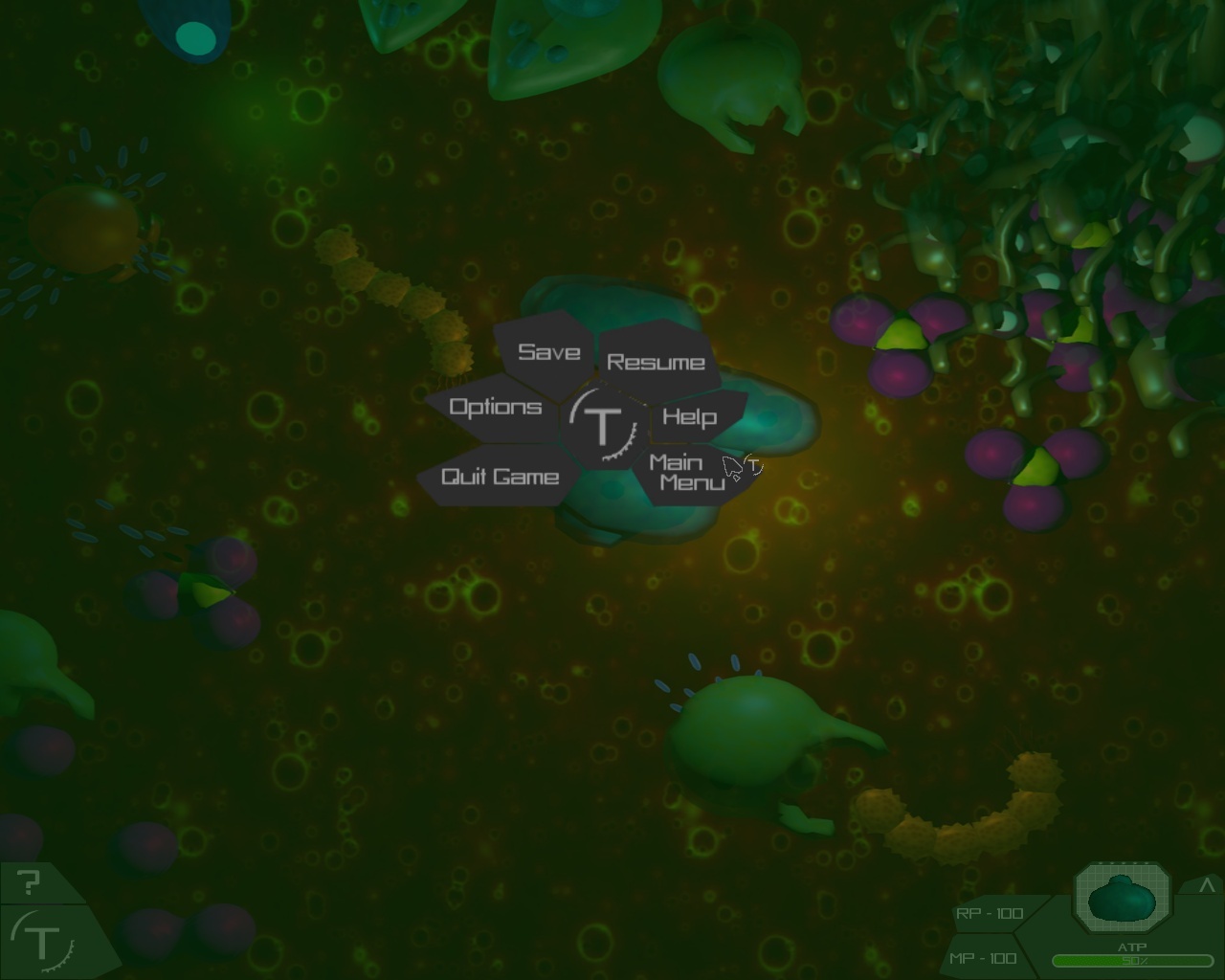
Nice Doctor! - Menu with color fade:
Also, I think I might have an Idea for how the menu shows up too. .3. A small black fragment sprite moves off the menu button when you click to open the menu, then stops in the middle, and crystallizes into the shape of the center frag, then 'seed' frags come off of it, and crystalize into the buttons, then the words carve themselves in. Though this all happens within the time of the color fading in. This all happens fairly quickly? Yes this is true. Awesome if it works? OOOOOOOOH YEEEEEEEEAAAAAAAAAAH this is true. .3. | |
|
  | |
Thriving Cheese
Art Team Lead

Posts : 321
Reputation : 9
Join date : 2013-01-06
Age : 25
Location : Sweden
 |  Subject: Re: Art Team: We Need You! Subject: Re: Art Team: We Need You!  Sun Jun 23, 2013 12:07 pm Sun Jun 23, 2013 12:07 pm | |
| - Aiosian_Doctor_Xenox wrote:
- Thriving Cheese wrote:
- Aiosian_Doctor_Xenox wrote:
- Heres the GUI I made with my current concept of the in-game menu.
- Le Spoiler:
Nice Doctor!
- Menu with color fade:
Also, I think I might have an Idea for how the menu shows up too. .3.
A small black fragment sprite moves off the menu button when you click to open the menu, then stops in the middle, and crystallizes into the shape of the center frag, then 'seed' frags come off of it, and crystalize into the buttons, then the words carve themselves in.
Though this all happens within the time of the color fading in.
This all happens fairly quickly? Yes this is true. Awesome if it works? OOOOOOOOH YEEEEEEEEAAAAAAAAAAH this is true. .3. Cool! | |
|
  | |
WJacobC
Outreach Team Lead

Posts : 220
Reputation : 17
Join date : 2013-04-05
Age : 26
Location : The United States of America
 |  Subject: Re: Art Team: We Need You! Subject: Re: Art Team: We Need You!  Sun Jun 23, 2013 12:15 pm Sun Jun 23, 2013 12:15 pm | |
| That looks great, and the animation concept sounds even better. Great job! | |
|
  | |
NickTheNick
Overall Team Co-Lead

Posts : 2312
Reputation : 175
Join date : 2012-07-22
Age : 28
Location : Canada
 |  Subject: Re: Art Team: We Need You! Subject: Re: Art Team: We Need You!  Mon Jun 24, 2013 3:18 am Mon Jun 24, 2013 3:18 am | |
| I commend your effort Doctor, but I think a more simple and symmetrical menu would be more effective. Also, correct me if I'm wrong but I've heard more complex menus and GUI makes it harder for modders. Regardless, I think a vertical list of buttons would be better. Also, words are generally used over icons in menu buttons.
Again, I hate to be the one guy who complains, but I personally prefer menus in the conventional style. | |
|
  | |
Thriving Cheese
Art Team Lead

Posts : 321
Reputation : 9
Join date : 2013-01-06
Age : 25
Location : Sweden
 |  Subject: Re: Art Team: We Need You! Subject: Re: Art Team: We Need You!  Wed Jun 26, 2013 3:09 pm Wed Jun 26, 2013 3:09 pm | |
| There's currently no 3D models left to do on my list, any suggestions for something 3d we might need? | |
|
  | |
~sciocont
Overall Team Lead

Posts : 3406
Reputation : 138
Join date : 2010-07-06
 |  Subject: Re: Art Team: We Need You! Subject: Re: Art Team: We Need You!  Wed Jun 26, 2013 3:39 pm Wed Jun 26, 2013 3:39 pm | |
| - Thriving Cheese wrote:
- There's currently no 3D models left to do on my list, any suggestions for something 3d we might need?
Nice work. Is there a spot where they're all posted/ images are posted? That would help. Also, they need to fit into these shapes (most should fit easily with just a bit of scaling)  If they don't consider making revisions. Also, the nucleus and kernel need to be modeled, I think. The nucleus should be spherical, and the kernel contains the nucleus, endoplasmic reticulum (which should appear as a folded membrane) and the golgi apparatus, which should appear as stacked sacs. | |
|
  | |
Aiosian_Doctor_Xenox
Learner

Posts : 196
Reputation : 5
Join date : 2013-05-27
Age : 34
Location : Kent
 |  Subject: Re: Art Team: We Need You! Subject: Re: Art Team: We Need You!  Wed Jun 26, 2013 3:53 pm Wed Jun 26, 2013 3:53 pm | |
| - NickTheNick wrote:
- I commend your effort Doctor, but I think a more simple and symmetrical menu would be more effective. Also, correct me if I'm wrong but I've heard more complex menus and GUI makes it harder for modders. Regardless, I think a vertical list of buttons would be better. Also, words are generally used over icons in menu buttons.
Again, I hate to be the one guy who complains, but I personally prefer menus in the conventional style. I'll see if I can find something. Though I was trying to make it different, since by far, Thrive is by no means a conventional game, IMO. .3. - Menu done in all text:
So, yeah. Save button's been modified a bit. | |
|
  | |
WilliamstheJohn
Regular

Posts : 409
Reputation : 10
Join date : 2012-12-26
Age : 31
Location : Third Rock from Sol
 |  Subject: Re: Art Team: We Need You! Subject: Re: Art Team: We Need You!  Wed Jun 26, 2013 4:01 pm Wed Jun 26, 2013 4:01 pm | |
| | |
|
  | |
Thriving Cheese
Art Team Lead

Posts : 321
Reputation : 9
Join date : 2013-01-06
Age : 25
Location : Sweden
 |  Subject: Re: Art Team: We Need You! Subject: Re: Art Team: We Need You!  Thu Jun 27, 2013 2:23 am Thu Jun 27, 2013 2:23 am | |
| - ~sciocont wrote:
- Thriving Cheese wrote:
- There's currently no 3D models left to do on my list, any suggestions for something 3d we might need?
Nice work. Is there a spot where they're all posted/ images are posted? That would help. I'll fix that. - ~sciocont wrote:
- Also, they need to fit into these shapes (most should fit easily with just a bit of scaling)
- Spoiler:
If they don't consider making revisions.
I'll fix that to. - ~sciocont wrote:
- Also, the nucleus and kernel need to be modeled, I think. The nucleus should be spherical, and the kernel contains the nucleus, endoplasmic reticulum (which should appear as a folded membrane) and the golgi apparatus, which should appear as stacked sacs.
I'll add them to the list. | |
|
  | |
Thriving Cheese
Art Team Lead

Posts : 321
Reputation : 9
Join date : 2013-01-06
Age : 25
Location : Sweden
 |  Subject: Re: Art Team: We Need You! Subject: Re: Art Team: We Need You!  Thu Jun 27, 2013 7:49 am Thu Jun 27, 2013 7:49 am | |
| Approximately how many tris should each organell be? (this question's to the proggraming team) | |
|
  | |
tjblazer85
Newcomer

Posts : 53
Reputation : 3
Join date : 2013-06-04
Age : 24
 |  Subject: Re: Art Team: We Need You! Subject: Re: Art Team: We Need You!  Thu Jun 27, 2013 9:06 am Thu Jun 27, 2013 9:06 am | |
| What does the kernel look like? | |
|
  | |
Sponsored content
 |  Subject: Re: Art Team: We Need You! Subject: Re: Art Team: We Need You!  | |
| |
|
  | |
| | Art Team: We Need You! |  |
|

 by
by 


